


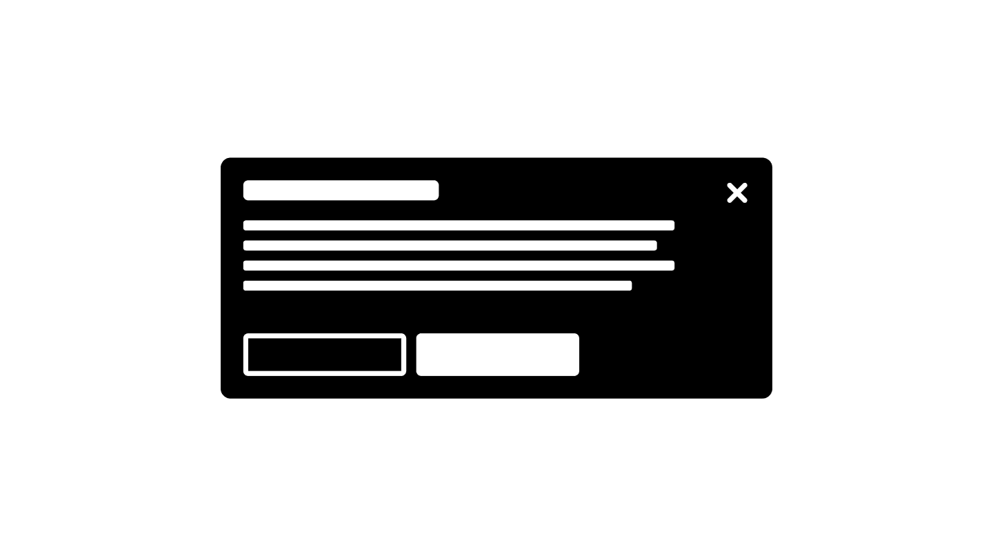
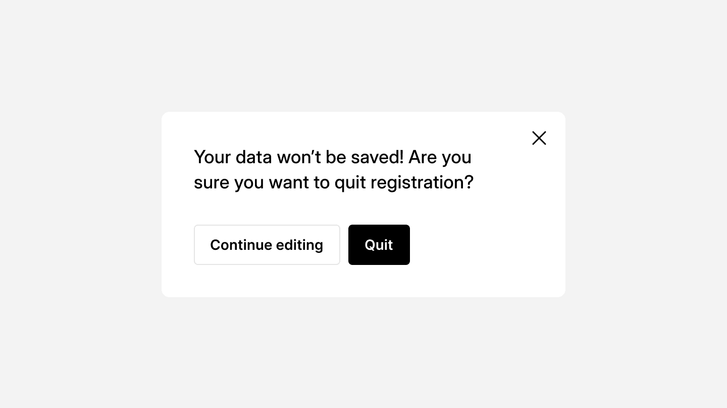
Modal
Modals are temporary overlays that require user interaction before continuing. They are used to display important information, request input, or confirm actions without navigating away from the current page.
Modal
Modals are temporary overlays that require user interaction before continuing. They are used to display important information, request input, or confirm actions without navigating away from the current page.
Modal
Modals are temporary overlays that require user interaction before continuing. They are used to display important information, request input, or confirm actions without navigating away from the current page.
A well-designed modal ensures clarity, focus, and accessibility, helping users complete tasks efficiently while preventing unnecessary disruptions.
When to use
✅ Confirming critical actions
✅ Requesting user input
✅ Displaying important alerts
✅ Focusing user attention
When not to use
⛔️ For minor notifications
⛔️ As a primary navigation method
⛔️ When users need background context
Modal types & behavior
Different modal variations are used based on the type of interaction required:
Modal type | Behavior |
|---|---|
Standard modal | Used for basic confirmations or additional details. |
Full-screen modal | Expands to cover the entire viewport for complex forms or workflows. |
Side panel modal | Slides in from the side, allowing users to reference other content. |
Alert modal | Focuses on warnings or urgent system messages. |
Best practices for usability
Keep content focused – Modals should contain only essential information and actions.
Use clear call-to-action buttons – The primary action (e.g., “Confirm”) should stand out, while secondary actions (“Cancel”) should be more subtle.
Prevent background interaction – Users should not be able to interact with elements outside the modal.
Allow easy dismissal – Users should be able to close modals using:
The
Escape keyA
close buttonClicking outside the modal (for non-critical dialogs)
<div class="modal-overlay">
  <div class="modal">
    <h2>Confirm Action</h2>
    <p>Are you sure you want to delete this item? This action cannot be undone.</p>
    <div class="modal-actions">
      <button class="button-secondary">Cancel</button>
      <button class="button-primary">Delete</button>
    </div>
  </div>
</div>
Accessibility considerations
Keyboard support – Users should navigate using the
Tab keyand close the modal withEscape.Focus management – When a modal opens, focus should move to the first interactive element inside.
ARIA attributes – Use
role="dialog"andaria-labelledbyfor screen reader support.
<div class="modal-overlay" role="dialog" aria-labelledby="modal-title" aria-modal="true">
  <div class="modal">
    <h2 id="modal-title">Confirm Action</h2>
    <p>Are you sure you want to delete this item?</p>
    <button>Cancel</button>
    <button>Delete</button>
  </div>
</div>
Continue reading
Looking to contribute?
Your input matters! Whether it’s feedback, design suggestions, or new ideas, every contribution helps shape a more refined, flexible, and efficient design system. Share your thoughts and be part of building something better for everyone.
Looking to contribute?
Your input matters! Whether it’s feedback, design suggestions, or new ideas, every contribution helps shape a more refined, flexible, and efficient design system. Share your thoughts and be part of building something better for everyone.
Looking to contribute?
Your input matters! Whether it’s feedback, design suggestions, or new ideas, every contribution helps shape a more refined, flexible, and efficient design system. Share your thoughts and be part of building something better for everyone.
Modal
Modals are temporary overlays that require user interaction before continuing. They are used to display important information, request input, or confirm actions without navigating away from the current page.
Modal
Modals are temporary overlays that require user interaction before continuing. They are used to display important information, request input, or confirm actions without navigating away from the current page.
Modal
Modals are temporary overlays that require user interaction before continuing. They are used to display important information, request input, or confirm actions without navigating away from the current page.
A well-designed modal ensures clarity, focus, and accessibility, helping users complete tasks efficiently while preventing unnecessary disruptions.
When to use
✅ Confirming critical actions
✅ Requesting user input
✅ Displaying important alerts
✅ Focusing user attention
When not to use
⛔️ For minor notifications
⛔️ As a primary navigation method
⛔️ When users need background context
Modal types & behavior
Different modal variations are used based on the type of interaction required:
Modal type | Behavior |
|---|---|
Standard modal | Used for basic confirmations or additional details. |
Full-screen modal | Expands to cover the entire viewport for complex forms or workflows. |
Side panel modal | Slides in from the side, allowing users to reference other content. |
Alert modal | Focuses on warnings or urgent system messages. |
Best practices for usability
Keep content focused – Modals should contain only essential information and actions.
Use clear call-to-action buttons – The primary action (e.g., “Confirm”) should stand out, while secondary actions (“Cancel”) should be more subtle.
Prevent background interaction – Users should not be able to interact with elements outside the modal.
Allow easy dismissal – Users should be able to close modals using:
The
Escape keyA
close buttonClicking outside the modal (for non-critical dialogs)
<div class="modal-overlay">
  <div class="modal">
    <h2>Confirm Action</h2>
    <p>Are you sure you want to delete this item? This action cannot be undone.</p>
    <div class="modal-actions">
      <button class="button-secondary">Cancel</button>
      <button class="button-primary">Delete</button>
    </div>
  </div>
</div>
Accessibility considerations
Keyboard support – Users should navigate using the
Tab keyand close the modal withEscape.Focus management – When a modal opens, focus should move to the first interactive element inside.
ARIA attributes – Use
role="dialog"andaria-labelledbyfor screen reader support.
<div class="modal-overlay" role="dialog" aria-labelledby="modal-title" aria-modal="true">
  <div class="modal">
    <h2 id="modal-title">Confirm Action</h2>
    <p>Are you sure you want to delete this item?</p>
    <button>Cancel</button>
    <button>Delete</button>
  </div>
</div>
Continue reading
Looking to contribute?
Your input matters! Whether it’s feedback, design suggestions, or new ideas, every contribution helps shape a more refined, flexible, and efficient design system. Share your thoughts and be part of building something better for everyone.
Looking to contribute?
Your input matters! Whether it’s feedback, design suggestions, or new ideas, every contribution helps shape a more refined, flexible, and efficient design system. Share your thoughts and be part of building something better for everyone.
Looking to contribute?
Your input matters! Whether it’s feedback, design suggestions, or new ideas, every contribution helps shape a more refined, flexible, and efficient design system. Share your thoughts and be part of building something better for everyone.