


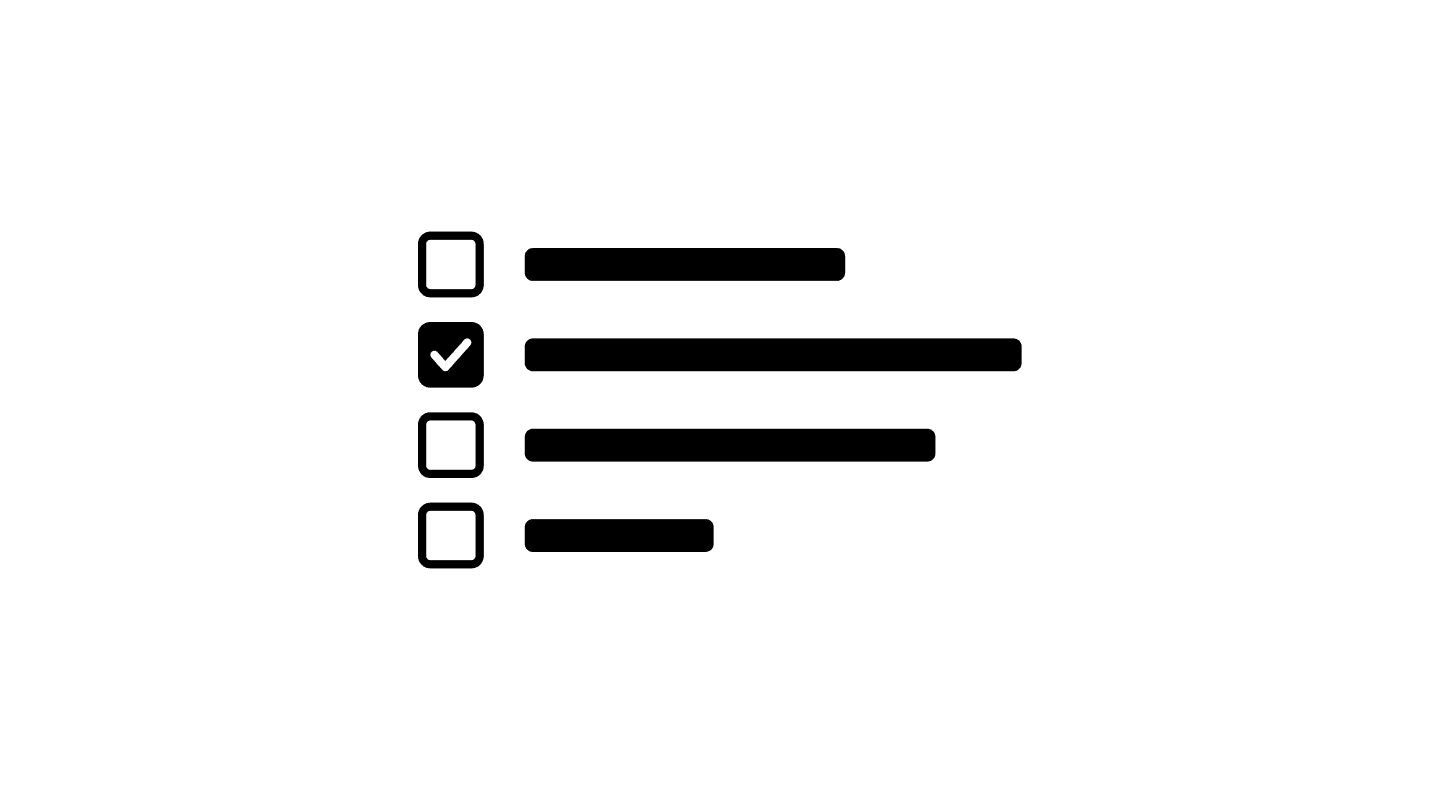
Checkbox
Checkboxes allow users to select one or multiple options from a list, making them essential for forms, settings, and filtering systems. They provide a simple yet effective way for users to toggle preferences, confirm agreements, or apply multiple selections at once.
Checkbox
Checkboxes allow users to select one or multiple options from a list, making them essential for forms, settings, and filtering systems. They provide a simple yet effective way for users to toggle preferences, confirm agreements, or apply multiple selections at once.
Checkbox
Checkboxes allow users to select one or multiple options from a list, making them essential for forms, settings, and filtering systems. They provide a simple yet effective way for users to toggle preferences, confirm agreements, or apply multiple selections at once.
A well-designed checkbox ensures clarity, accessibility, and ease of interaction, improving usability across desktop and mobile experiences.
When to use
✅ Multiple selections
✅ Binary toggles
✅ Task completion
✅ Form preferences
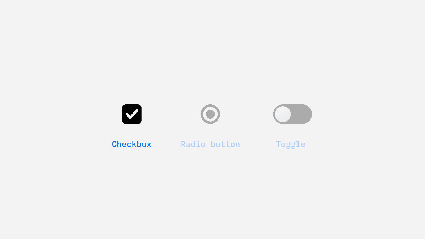
When not to use
⛔️ For single-choice selections
⛔️ For primary actions
⛔️ If a switch is more appropriate
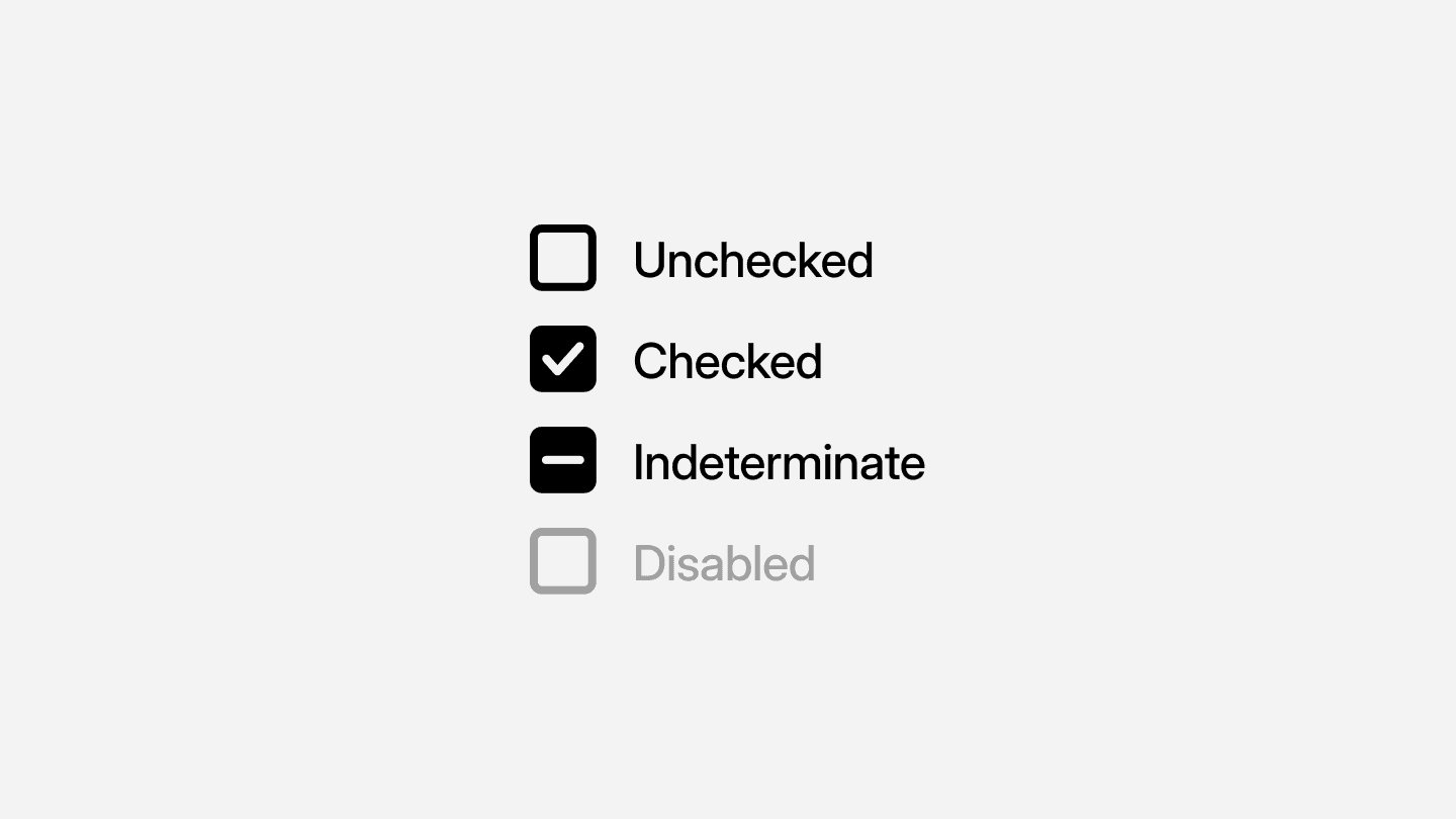
Checkbox states & behavior
Checkboxes should always provide clear visual feedback based on user interaction.
State | Behavior |
|---|---|
Unchecked | Default state before user interaction. |
Checked | Selected state when a user chooses the option. |
Indeterminate | Used for mixed states (e.g., parent checkboxes in nested lists). |
Disabled | Gray-out state when the checkbox is inactive. |
Checkboxes should have large enough touch targets (at least 44x44px) to ensure easy interaction on mobile devices. Labels should always be clickable, so users can select a checkbox by clicking the text as well.
<label>
  <input type="checkbox" name="option1">
  Enable notifications
</label>
For better accessibility and keyboard navigation, ensure that checkboxes are properly labeled and follow standard HTML structures.
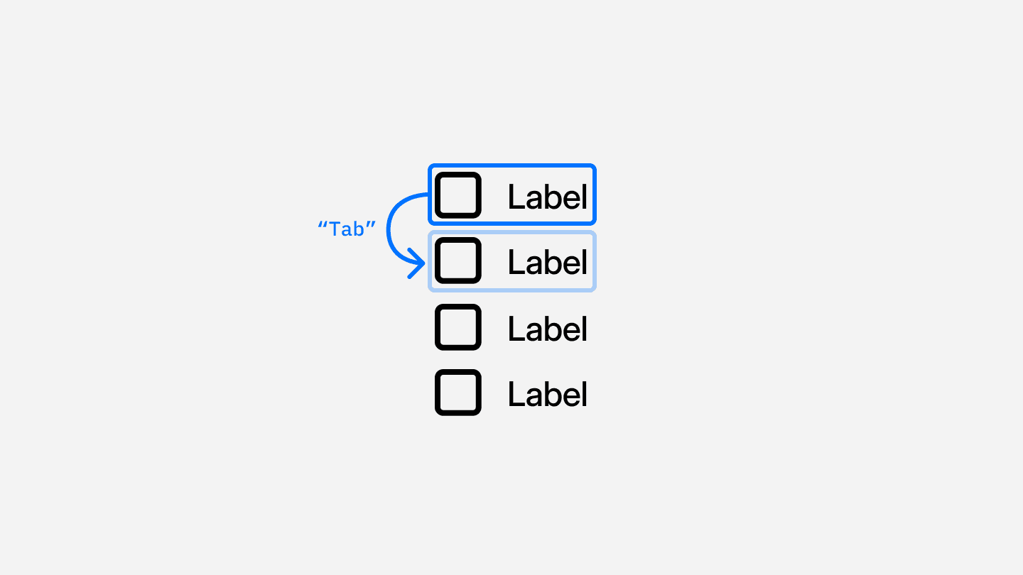
Accessibility considerations
Keyboard Support – Users should navigate checkboxes using the
Tab keyand toggle them usingSpacebar.ARIA Attributes – Use
aria-checked="true/false"for screen reader compatibility.Focus States – Provide clear focus outlines when checkboxes are selected.
Sufficient Contrast – Checkbox borders and labels should have strong contrast against the background for readability.
<input type="checkbox" id="subscribe" aria-checked="false">
<label for="subscribe">Subscribe to newsletter</label>
Continue reading
Looking to contribute?
Your input matters! Whether it’s feedback, design suggestions, or new ideas, every contribution helps shape a more refined, flexible, and efficient design system. Share your thoughts and be part of building something better for everyone.
Looking to contribute?
Your input matters! Whether it’s feedback, design suggestions, or new ideas, every contribution helps shape a more refined, flexible, and efficient design system. Share your thoughts and be part of building something better for everyone.
Looking to contribute?
Your input matters! Whether it’s feedback, design suggestions, or new ideas, every contribution helps shape a more refined, flexible, and efficient design system. Share your thoughts and be part of building something better for everyone.
Checkbox
Checkboxes allow users to select one or multiple options from a list, making them essential for forms, settings, and filtering systems. They provide a simple yet effective way for users to toggle preferences, confirm agreements, or apply multiple selections at once.
Checkbox
Checkboxes allow users to select one or multiple options from a list, making them essential for forms, settings, and filtering systems. They provide a simple yet effective way for users to toggle preferences, confirm agreements, or apply multiple selections at once.
Checkbox
Checkboxes allow users to select one or multiple options from a list, making them essential for forms, settings, and filtering systems. They provide a simple yet effective way for users to toggle preferences, confirm agreements, or apply multiple selections at once.
A well-designed checkbox ensures clarity, accessibility, and ease of interaction, improving usability across desktop and mobile experiences.
When to use
✅ Multiple selections
✅ Binary toggles
✅ Task completion
✅ Form preferences
When not to use
⛔️ For single-choice selections
⛔️ For primary actions
⛔️ If a switch is more appropriate
Checkbox states & behavior
Checkboxes should always provide clear visual feedback based on user interaction.
State | Behavior |
|---|---|
Unchecked | Default state before user interaction. |
Checked | Selected state when a user chooses the option. |
Indeterminate | Used for mixed states (e.g., parent checkboxes in nested lists). |
Disabled | Gray-out state when the checkbox is inactive. |
Checkboxes should have large enough touch targets (at least 44x44px) to ensure easy interaction on mobile devices. Labels should always be clickable, so users can select a checkbox by clicking the text as well.
<label>
  <input type="checkbox" name="option1">
  Enable notifications
</label>
For better accessibility and keyboard navigation, ensure that checkboxes are properly labeled and follow standard HTML structures.
Accessibility considerations
Keyboard Support – Users should navigate checkboxes using the
Tab keyand toggle them usingSpacebar.ARIA Attributes – Use
aria-checked="true/false"for screen reader compatibility.Focus States – Provide clear focus outlines when checkboxes are selected.
Sufficient Contrast – Checkbox borders and labels should have strong contrast against the background for readability.
<input type="checkbox" id="subscribe" aria-checked="false">
<label for="subscribe">Subscribe to newsletter</label>
Continue reading
Looking to contribute?
Your input matters! Whether it’s feedback, design suggestions, or new ideas, every contribution helps shape a more refined, flexible, and efficient design system. Share your thoughts and be part of building something better for everyone.
Looking to contribute?
Your input matters! Whether it’s feedback, design suggestions, or new ideas, every contribution helps shape a more refined, flexible, and efficient design system. Share your thoughts and be part of building something better for everyone.
Looking to contribute?
Your input matters! Whether it’s feedback, design suggestions, or new ideas, every contribution helps shape a more refined, flexible, and efficient design system. Share your thoughts and be part of building something better for everyone.